


PANTONE 16-1546, or “Living Coral”, is a vibrant mix of red, orange, and pink, resulting in a bold yet relaxed look. Living Coral inspires a much different mood than Ultra Violet. Whereas Ultra Violet has a mysterious look that creates a mature tone when used in the room, Living Coral is more optimistic, creating a brighter look for the space.
How Does Living Coral Change The Mood Of The Space
We all know that color has an impact on the space and how we perceive it. It imbues the room with a specific mood, such as yellow creating a more cheerful look, green creating a more calming effect, and black with a luxurious, dramatic aesthetic. Where does Living Coral fit in? In interior design, Living Coral straddles the line between a handful of colors, making it quite unique. It’s orange with red and pink in there as well. Let’s look at each of these colors individually.

Credit: Pantone
The core color of orange is bold and playful. It creates an eccentric look that definitely differentiates itself from more neutral or basic colors, like beige, white, or black. Orange is a color that garners attention immediately. While darker orange colors have a mature tone that’s more on the earthy or organic side, Living Coral uses a brighter orange as its base, so we won’t go too much detail. Next, red rivals orange as one of the most energetic colors. It’s a strong color that instantly dramatizes a room, but whereas orange is playful, red is passionate and dramatic. Lastly, pink makes a subtle appearance in Living Coral and this lighter color serves to balance the harshness of the red and orange. It keeps the other colors from being too overwhelming and provides a nice contrast.
How Do I Shop For Living Coral Products?
When organizing wallpaper into different color categories, home décor sites try to choose categories that make sense and can be easily populated with different products. That’s why when you visit a wallpaper site, you’ll often find color categories like “green,” “purple,” or “blue,” but you won’t find links to wallpaper colors like “magenta,” “teal,” or “cyan.” Pantone’s Living Coral is a color that exists within the spaces that aren’t generally covered. How can you find coral colored wallpaper? We suggest looking at similar categories, starting with pink wallpaper and pastel wallpaper. Red wallpaper and orange wallpaper categories can also be explored, but pink and pastel provide two excellent starting points.
Living Coral Wallpaper Colors
Pantone’s Color of the Year selections are always very specific. While the exact match may be hard to find, there are wall décor options that get quite close. On the other hand, if you’re a fan of the idea of coral colors but you want a different shade, we’ve got you covered as well. Here are our selections of wallpaper that will get you the “living coral” look!

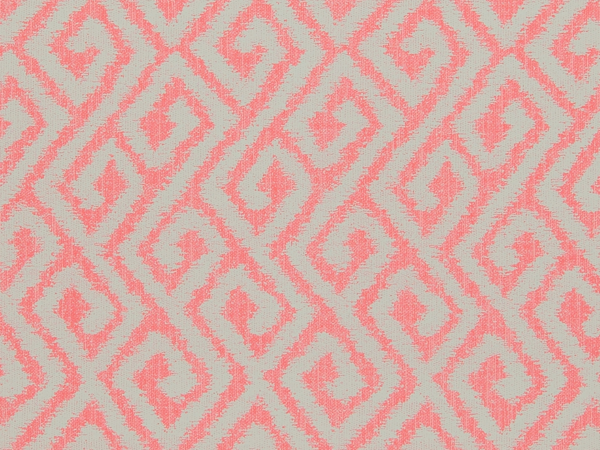
With a slightly heavier pink undertone, Coral Bohemian is a creative take on geometric prints. It makes excellent use of the bold coral color, creating a look that really pops off the walls. The static/shaky design of the lines give it a more energetic sense of movement, rather than the crisp, clean lines of many other modern geometric wallpapers.

Classic Bird Of Nature Baby Pink And Green Wallpaper R4178
This next coral wallpaper uses an interesting color palette that emphasizes contrast. While the coral colored background is vibrant and catches our attention, the main imagery is rendered in shades of gray, black, and white. The overall color palette has a retro-inspired look that’s enhanced by the watercolor aesthetic of the leaves and birds.

Bohemian Persian Rug Inspired Coral and Indigo Wallpaper R4705
Even though living coral is such a strong, unique color, it can still be successfully paired up with other colors to create interesting combinations. Our next coral wallpaper pick is this Bohemian-inspired wallpaper that features intricate details and stunning colors. From the deep purples to light blues, coral may take center stage but it shares it well with other colors.

Natural Woven Purple and Green Grasscloth Wallpaper R4587
Grasscloth wallpapers generally come in neutral colors, such as beige, but some have been dyed to give it a bolder look. Our next pick for coral wallpaper is this minimalist yet engaging grasscloth design. As with any natural wallpaper, it has a highly textured surface, giving the walls a different characteristic.

If you’re creating a feature wall, plain or textured wallpaper can be used to complement the main design. Sparkle, a minimalist textured print, adds a burst of color to the space, giving it a sense of energy. To balance out the vibrant look, consider choosing a feature wall that uses fewer colors, or one that’s black and white to create a color contrast with the coral.

Last but not least, Pantone’s Living Coral is also represented in our wallpaper murals, with this Sea Anemone print. The image is brought to life thanks to the high-quality printing process our digital wallpaper murals go through. The colors are rich, the details are crisp, and as with any wallpaper mural, this one can be custom fit to your wall.
How To Use Living Coral Colors In Interior Design
Living Coral is a strong color on its own and homeowners have a variety of ways to use it in their own interior design. Because it’s so vibrant, coral is perfectly suited for use as a feature wall since these walls often get a lot of attention. Overuse of bold coral colors can create a room that looks tacky or overwhelming, so be sure to test out the pattern for your specific space. Walls Republic offers free samples, making it a great way to get a physical piece of the actual wallpaper. This can give you a better sense of the color and how it’ll fit in with the rest of your room.
To emphasize its playful nature, pair living coral with colors such as turquoise and pastel pink. To create a bolder, mature look, pair living coral with darker colors to really bring out that vibrant contrast, such as teal and black. We’ve creates some interesting color palettes below using Pantone’s Living Color as a starting point.


