


While selecting tone on tone wallpaper is just like selecting any other wallpaper there are several elements that you should have an even more heightened
1. TONE ON TONE WALLPAPER: Contrast - Light vs. Dark Tones

Choosing patterns with good tonal contrast will help and dimension and texture to your

Slate Scratched Tone on Tone Wallpaper R2440
If you truly want your pattern to be seen having a strong contrast will be crucial. Consider who is using the space as well, older eyes will have a harder time distinguishing between

Coral Lattice Tone on Tone Wallpaper R2551
Vibrant
2. TONE ON TONE WALLPAPER: Lighting

Slate Hexagonal Tone on Tone Metallic Wallpaper R2253
Lighting is crucial when selecting tone on tone wallpapers as it will help define a show off the pattern of your wallpaper. If your tone on tone wallpaper is not effectively lit you may not see any pattern at all. When Slate Hexagonal is lit the pattern is highly visible however, when seen in the shadow the pattern is masked and hidden therefore providing good lighting throughout the space is crucial if you wish to see the pattern.
Metallic tone on tone detail provides a good way to play with pattern and texture and reflect light well to help display pattern. Tone on tone wallpapers are very on trend and can be elegant and sophisticated when carefully placed.
3. TONE ON TONE WALLPAPER: Pattern Scale

Blue-Grey Tiled Tone on Tone Wallpaper R2265
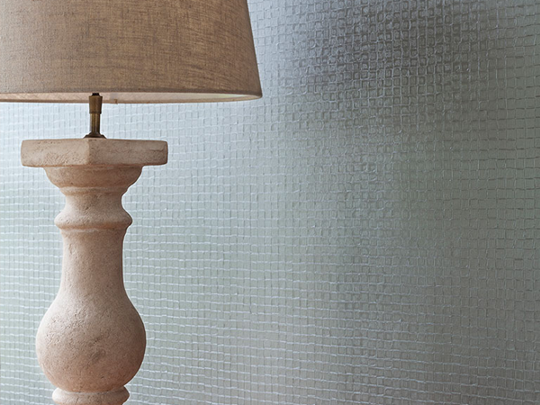
Pattern scale will also strongly influence the effect of your wallpaper in your interior. A small scale pattern will have a more textural look where patterning may only be seen from a particular angle or up close. Specific lighting techniques will help bring out the subtleties in texture and colour especially in an allover metallic tone on tone wallpaper.

Warm Grey Puppytooth – Houndstooth Home Wallpaper R2547
Tone on tone wallpapers can also be really calming and soothing in a space of relaxation. This small scale houndstooth wallpaper has a graphic look from up close but from far away has a more all over monochrome look. This is great in a more small scale or intimate space such as a bedroom where you have a bed or a chair up against the wall as the small scale pattern will appear larger when you are up close.

Ecru Rings Tone on Tone Wallpaper R2307
In a larger scale the pattern is more apparent and grander but still has a very muted and simple effect in a tone on tone neutral colour scheme. Subtle nuances like tone on tone wallpapers are great for tying your entire design together and adding a little more dimension and depth to your walls than paint would enable you to achieve. They still help you create that one-of-a-kind look without the fuss of a more graphic or eclectic look and will be a smooth addition to your interiors.

