


For your next interior design project, why not get a little creative with your room’s walls? Instead of using just one wallpaper pattern, why not mix and match different ones? In this “how to” article, we’ll provide our own tips for using different wallpaper styles and showcase some of our favourite multi-patterned look!
In many cases, mixing and matching different patterns means you’ll be creating a feature - or accent - wall (click here to read our guide on how to create a feature wall). However, this isn’t always the case. Sometimes for a truly unique and interesting look, you might be using the same pattern but in different colors. Below, we’ve categorized distinct “looks” for your home.
Table of Contents
Mix wallpaper - The Artistic Wall
# of wallpaper patterns: 1 large-scale pattern, 3 smaller scale or abstract patterns
Color palette: Complimentary color scheme or same color scheme
This style is super trendy and simpler to accomplish than the other styles. For the “artistic” wall, you’ll want to choose a large-scale pattern; something that is really noticeable the moment you enter the room. Most of the time, this means the design will generally be more detailed and complex.
If you’ve already chosen your large-scale pattern, you can easily narrow down the wallpaper choice for your other three walls. Keep in mind that to make the feature wall truly shine, the other 3 walls should have wallpaper patterns that aren’t too overpowering. Here are some of our suggestions:

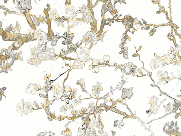
White Blossoming Almond Trees R5004 (feature wall design) and Contemporary Faux Brick Industrial Chic White Brick Wall Wallpaper (other design)
Traditional meets contemporary! What we absolutely love about this match-up is a blend of the more classical floral design with an ultra modern brick faux finish. Both wallpaper styles compliment each other well and they never go out of style! This year in particular, faux finish wallpaper styles are a popular choice among many interior designers.
In terms of color, we decided to go with a white brick pattern to keep the focus solely on the beautiful golden flower blossoms. For a look that has more contrast, the same brick wallpaper design is also available in grey and black. However, we really like the clean-cut look of pairing two white wallpapers together. White may seem like a boring design choice, but because these two designs feature interesting patterns, it adds a lot of style to any room.

Floral wallpaper styles are often chosen for feature walls because of its highly detailed design. For some people, having a pattern like Lilac Vintage Blossoms on all four walls would look too complicated or “busy,” which is an issue for smaller spaces. However, feature walls get rid of this problem and the complex design is used in smaller doses.
In this example, we’ve paired the gorgeous pink and purple floral pattern with a grasscloth wallpaper design that features a lovely gradient of colors. The darker purples used on the grasscloth is a nice compliment to the lighter purples in the floral wallpaper design. We love how these two wallpaper patterns offer a sense of elegance and sophistication.

Paris From Way Up M9069 (feature wall design) and Light-Grey Calculate R2491 (other design)
Wallpaper murals are often used as feature walls and for this inspirational look, we’re going to Paris! Urban wallpaper murals feature a photorealistic finish that brings a touch of modernity to any room. It’s like taking a vacation without leaving your home.
For the secondary design, we’re using a light grey geometric wallpaper pattern that has a creative, rustic touch. The angular pattern also mimics the urban theme found in the main mural. For a darker, more dramatic look, the Calculate pattern is also available in black and taupe.

Classic Bird Of Nature Black And Green Wallpaper R4176 (feature wall design) and Black & White Chevron Stripe R2552 (other design)
For a more funky, eccentric look, pairing two bold patterns together can do the job! The trick is to pay careful attention to color usage so that the two patterns don’t clash or become too overwhelming. In this pairing, the feature wall uses Classic Birds of Nature, a wallpaper design that is bursting with vibrant colors. This pattern’s a favourite with designers who want a playful, modern look.
In contrast, Chevron Stripe is only black and white, but features a bold geometric pattern that can stand well on its own. By using this as the other wallpaper design on the remaining three walls, the thick vertical lines help focus attention on the featured wallpaper. The dynamic movement of the zigzagging pattern directs our eyes towards the centerpiece of the room – the feature wall.
Mix wallpaper - The Cohesive Look
# of wallpaper patterns: Two
Color palette: same/similar color scheme
With the previous category, one wall was the highlight of the room’s design and it often featured a much larger design than the other three walls. On the other hand, this “cohesive” style uses two patterns that compliment each other – one design isn’t considered “more important” than the other. Because you’re mixing different patterns that play an equal role in the interior design, building a cohesive look means using a similar color scheme.
Where should the two patterns be placed? Take a look at the images below:
Adjacent Wall Style

Consider a room with four walls, labeled A, B, C, and D. With feature walls, our large-print wallpaper design would go on one wall (e.g. wall B) while the simpler design would go on the remaining walls (e.g. walls A, C, and D).
However, in this "adjacent" style, we have two equally important wallpaper patterns so to give both of them the same amount of attention, we're using it on adjacent walls. One pattern would go on walls A and D; the second pattern on walls B and C.
Opposite Wall Style

In this second example, the same wallpaper is placed on the opposite wall. The first wallpaper style will be on walls A and C; the second wallpaper pattern will go on walls B and D.
Of course, not all rooms will be perfectly square-shaped or rectangular, so apply this adjacent vs. opposite principle to your own space. With that out of the way, let’s take some wallpaper pairings!

Marsala Burgundy Romance R3035 (left) and Chic Glamorous Rustic Metallic Silver Spotted Red Wallpaper R3802 (right)
For an intense, romantic look, this pairing does the trick. Both patterns feature metallic embellishments that reflect the light, creating a brilliant effect throughout the room. With the first pattern, it features an innovative abstract floral design that is absolutely stunning, making it a perfect choice for spaces such as bedrooms and living rooms. The large, flowing design is also dynamic and exciting, making it contrast with the more compact, geometric-esque visuals of the second wallpaper.
The second wallpaper style is incredibly glamorous and has a rustic, weathered aesthetic that gives it an ultra contemporary look. The silver colors compliment the dark red shades very well, creating a stylish and luxurious appeal. What we love about this design are the red accents that “break” through various areas of the silver pattern.

While this pairing could work as a feature wall, we think these patterns look great when used as an “Opposite Wall Style.” The deep teal of Padded Textile and the light beige/yellow of Blooming Dreams makes for a stunning contrast that caught our attention immediately.
Mixing geometric and floral designs can be tricky. After all, they’re two completely different wallpaper styles; geometric is generally considered more modern whereas floral is more traditional. However, this geometric pattern is reminiscent of classic aesthetics, making it a great pairing with the floral wallpaper.

Let’s follow up the previous example with another vibrant look! The first design is a wood faux finish wallpaper with a light mahogany wash, giving it a colored yet faded effect. Its detailing provides a high level of realism, giving it an aged, weathered look that’s pretty much standard in the faux finish wallpaper category. Orange Cluster, on the other hand, is incredibly bold – the orange color stands out immediately and the geometric accents give it a playful look.
Why use the two together? Because the two designs balance each other out. The colors on the faux finish wallpaper may be more muted, but there’s a higher level of detail on the actual pattern. In contrast, Orange Cluster has a much stronger color, but its pattern is simpler. By using the two together, you balance both the design and color intensity.
Mix wallpaper - The Gradient Look
# of wallpaper patterns: One
Color palette: Complimentary color scheme or same color scheme
In the majority of cases, a wallpaper pattern is available in many different color options. For our final room design style, the idea is to use one pattern but in different color options to create a complimentary or “gradient” color effect. Generally, you’ll want to stick to two different color options. Any more and you run the risk of the design looking too eclectic and messy!
Like the “cohesive look” category, the placement of the two wallpapers is up to you. As always, getting free samples and testing them out on your walls is a great idea to avoid disappointment later. Here are some of our favourite "gradient" looks!

Available in four distinct colors, Trigonal Wallpaper offers a lot of creativity. Will you pair the multicoloured pattern on the bottom right with the black and taupe design in the top right? This would create a bold, vibrant look.
On the other hand, the black/taupe wallpaper could be combined with the white wallpaper on the bottom left to create a more minimalist look. Lastly, combining the two multi-colored wallpaper styles is an interesting option for a creative, gradient effect.

Tropical Natural Green And Baby Blue Leaves Wallpaper R4192 (top left),
Tropical Natural Green And White Leaves Wallpaper R4191 (top right),
Tropical Natural Grey And White Leaves Wallpaper R4190 (bottom)
Unlike the previous example, this Tropical Leaves wallpaper can create a subtle, more traditional gradient look thanks to its similar and limited color options. One unique way to use this pattern is to have one wall feature the dark green wallpaper pattern on the top left, and the other three walls feature the grey wallpaper pattern. Alternatively, any two wallpaper choices can fit the “adjacent vs. opposite” layout mentioned above.

Rush Grass Green Grasscloth R2003 (top left),
Rush Regular Orange Grasscloth R2001 (top right),
Rush Regular Yellow Grasscloth R1999 (bottom right),
Rush Yellow Grasscloth R1986 (bottom left)
Many grasscloth wallpaper patterns lend themselves well to being mixed and matched with others. Because of the manufacturing process and the fact that the wallpaper is made with natural materials, grasscloth wallpapers have a random match – in other words, you don’t have to place the wallpaper on the wall at a specific location. Due to its random nature, you can even place different grasscloth strips next to each other, like in this example below:

The Rush grasscloth wallpaper series are available in a bunch of fun, animated colors that are sure to liven up your room. For a light, fresh look, why not pair Rush Grass Green (top left) and Rush Yellow (bottom left)? These two colors convey a very “tropical” feel, giving the interior space an organic aesthetic.

