


Dark Wallpaper vs. Light: Which Wallpaper Color is Better For Home
One important part of selecting the perfect wallpaper print for your space is making sure you're choosing the right shade or tint. In other words, will your wallpaper be a dark colored wallpaper or a light colored one? For those who have been following some of our previous articles, we've mentioned a bit here and there about when you want to choose light versus dark wallpaper colors, but in this article, we'll go into more detail about both of these groups.
Light Wallpaper Colors
Since color can affect our mood and the way we perceive a space, learning how to "read" the emotion of a wallpaper color is important since it can alter the atmosphere of the room you're designing. Light wallpaper colors tend to make a room feel brighter, more open, and welcoming. A popular sub-category of light-colored wallpaper is pastel, which includes a variety of light colors such as blue, gree, pink, and purple. These are typically used to add some color to the space, but aren't overwhelming since they're lighter and less vibrant.
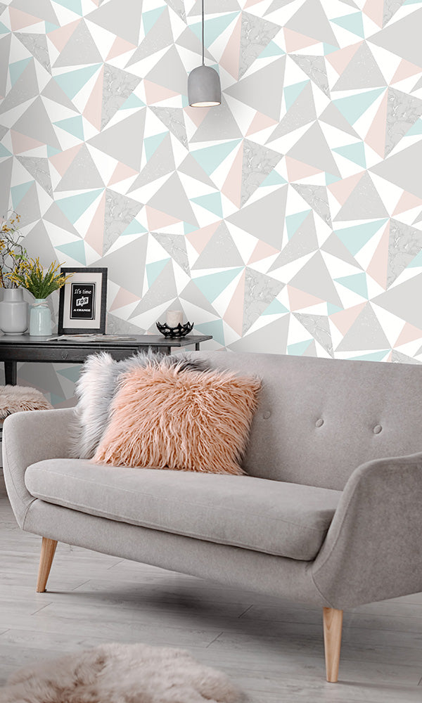
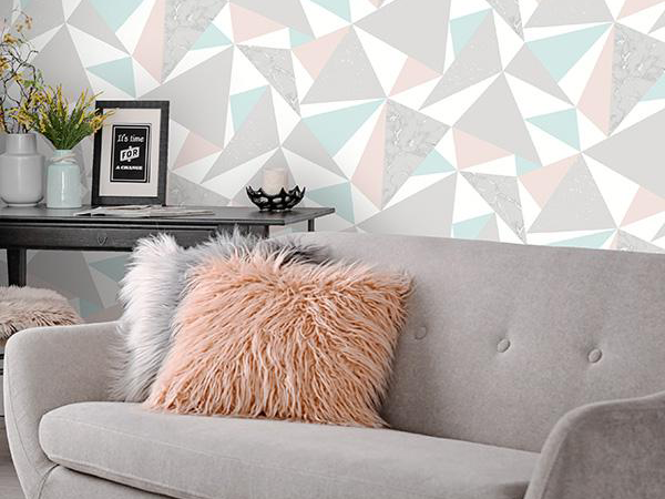
Pink & Soft Teal Party Triangles R6110
Another good category for light-colored wallpaper is neutral, which can include white, beige, taupe, and gray. Whereas pastel colors give the room a lighthearted, playful aesthetic, light neutral wallpaper colors tend to give the space a more classic or traditional feel.

White Almond Blossom Floral Wallpaper R5004
Between light and dark wallpaper colors, light colors are definitely more versatile since they look great in both small and large room sizes. Light wallpaper colors tend to unify the space much more, blending into the background rather than being the very first thing you see in the room.
This White Almond Blossom wallpaper in a light white color with textured gold almond blossom pattern has been an international success. This unique wallpaper inspired by famous work of Dutch Painter Vincent Van Gogh in which the soul of his paintings is captured, including imperfections. Designed and reproduced with care, respect and love. To use the words of the master himself: “What is done in love is done well’.
Neutral or light wallpaper like this R5004 will always be a classic. If the mood strikes and you decide you need some vibrant hues in your life, then you simply add a few inexpensive pillows in a bold color or buy a beautiful bouquet of bright flowers and you're good to go, no need to do a total make over.
Often times, you'll see these colors used as the "base" for interior design, such as the carpeting in a room, or light beige paint on the walls. However, while neutral colors are versatile, they're far from generic. One of the biggest benefits is that light neutral wallpaper colors can be easily paired up with other colors to create more interesting, colorful looks.
When To Use Light Colors
If you're looking for wallpaper to decorate a smaller space, it's often recommended that you start looking at light wallpaper colors first. Because light wallpaper colors can make a room feel more spacious, this makes it well suited for smaller rooms. In addition, using light wallpaper colors in rooms under less optimal lighting can be beneficial.

This cute laundry room in a blush colored wallpaper features large peacocks and flowers in an illustrative style. A balance of bold and thin linework with an overall metallic sheen makes this simple contemporary wallpaper ideal not only for laundry room but also for a cool kids' or teens' bedroom. You want a unique interior that speaks to your vibrant personality, So you think this neutral colored wallpaper would work for you, right?

Cream Vintage Paisley Blossoms Wallpaper R6415
The photo above features fun, vintage floral wallpaper adorned with whimsical flowers in a paisley style. Bright and bold colors pop off the wall in this charming wallpaper design, making it a great statement wallpaper for your powder room or bedroom. Eclectic and evocative, this cream floral wallpaper will make any room feel even softer.
Between light and dark wallpaper colors, light colors are definitely more versatile since they look great in both small and large room sizes. Light wallpaper colors tend to unify the space much more, blending into the background rather than being the very first thing you see in the room.
This can be a benefit for those who want to create a more relaxed rather than dramatic aesthetic. Light wallpaper colors aren't as "loud" as dark colors, which is useful for rooms like a home office or a bedroom if you want to create a more casual, calming space.
Dark Wallpaper Colors
While light wallpaper colors can make a room feel brighter and more spacious, dark wallpaper colors do the opposite. They can make a space look more enclosed, cozy, or smaller. Dark wallpaper colors are great for creating spaces that feels more intimate, so it's a good option if you have a larger space and you want to create this kind of aesthetic.
Some popular dark colors in our wallpaper catalogue include dark neutrals, such as dark brown, black, dark taupe, and dark gray. Similar to light neutrals, dark neutral colors are very versatile in terms of what other colors you want to pair it up with.

Charcoal Climbing in the Trees Wallpaper R6468
While light wallpaper colors can make a room feel brighter and more spacious, dark wallpaper colors do the opposite. They can make a space look more enclosed, cozy, or smaller. Dark wallpaper colors are great for creating spaces that feels more intimate, so it's a good option if you have a larger space and you want to create this kind of aesthetic.
Some popular dark colors in our wallpaper catalogue include dark neutrals, such as dark brown, black, dark taupe, and dark gray. Similar to light neutrals, dark neutral colors are very versatile in terms of what other colors you want to pair it up with.
Dark Walls and Patterned Wallpapers is undeniably the latest trend. As people continue to desire more luxurious spaces that create areas of harmony in the home, it is no surprise that dark colored wallpaper is only growing in popularity.
Like for an instance, the sample wallpaper above which is Charcoal Climbing in the Trees Wallpaper is a bolder and trendy option that will give a room a sense of nostalgia with its tropical nature pattern featuring botanical palm trees adorned with cute little squirrel monkeys climbing throughout. The black color and painted canvas look gives a slightly vintage vibe, making this a fun, yet elegant contemporary style living wallpaper.
Compared to light wallpaper colors, dark wallpaper colors demand attention; it's usually the very first thing you see when you enter the room. Dark colors tend to be more dramatic in terms of altering the mood of the space, which is both a pro and a con, depending on what you want to achieve with your interior design.
When To Use Dark Colors
In general, dark colors aren't a good fit for smaller spaces as it can make the room feel more cramped or even smaller than it actually is. This means that smaller rooms are generally "harder" to choose wallpaper colors for since you have fewer options. You can work around this by using a dark wallpaper as a feature wall on a single wall in the room, minimizing the "enclosed" feeling you would get if you used it throughout the entire space.
However, if you're decorating a mid to large-sized room, your options are more open and you can use both light or dark colors. When using dark wallpaper colors, do keep in mind that it does create the look and feel or a more enclosed space. This can be great if you want to create a bedroom or living room that looks more cozy.
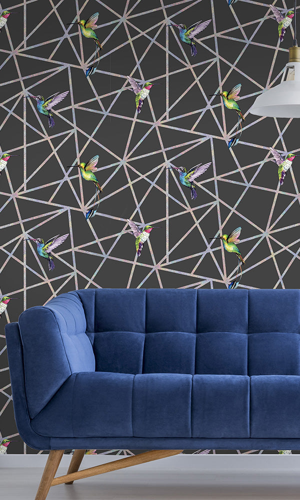
Black Holographic Hummingbirds R6095
This Black Holographic Hummingbirds wallpaper in bright, bold flying hummingbirds in this fun and vivid geometric wallpaper makes a dramatic statement in the room. Hand-drawn birds that are painted and lined with ink contrast against a holographic web of linework in the background. A metallic sheen coats the geometric lines for an added playful effect. The timeless design and sophisticated aura of black wallpaper can be used to create a modern feature wall, when combined with more neutral colours or used throughout an entire room.
Keep in mind that dark wallpaper has a much more dramatic impact on a room than light colored wallpaper. If your room has poor lighting conditions (such as no windows), dark colors can make the space feel drab or depressing. Dark wallpaper colors tend to take over the entire space in a more powerful or dominant way than light colors; light wallpaper colors tend to "sit back" and blend into the space more effectively rather than becoming the center of attention.
Comparing Light vs. Dark Wallpaper Colors
Colors lend a very specific look and feel to the space, changing the mood of the room. Below is a brief summary of what each color "adds" to the room in terms of its emotional impact or association. Keep in mind this is just a generalization but it can help as a starting point for when you need to select your own wallpaper color.
LIGHT COLORS
- Light gray: sophisticated, contemporary
- Light blue: optimistic, lighthearted
- Light purple: artistic, floral
- Light red: sassy, creative
- Light pink: soft, floral
- Light green: organic, refreshing, natural
- Light yellow: cheery, happy, welcoming
- Light orange: refreshing, energizing
DARK COLORS
- Dark gray: mysterious, dramatic, grunge
- Dark blue: royal, classy
- Dark purple: regal, elegant
- Dark red: romantic, emotional, dramatic
- Dark pink: flirty, energetic
- Dark green: enigmatic, classic
- Dark yellow: classy, sophisticated
- Dark orange: eccentric, original, out-of-the-box
How To Use Both Light and Dark Colors

Navy & Coral Party Triangles R6111
While you can find wallpaper patterns that use only light colors or only dark colors, more often than not, you'll find wallpaper designs that use both light and dark colors together. For example, this watercolor Wetlands wallpaper below uses dark shades of blue to create the grassy areas, but this is offset with light green, light blue, and white.
When a wallpaper pattern uses both light and dark colors, this create an interesting visual contrast that brings more attention to all colors. In other words, we notice the grassy areas of the wallpaper below because it's dark and we notice the lighter areas because it's contrasted against the darker parts of the wallpaper.
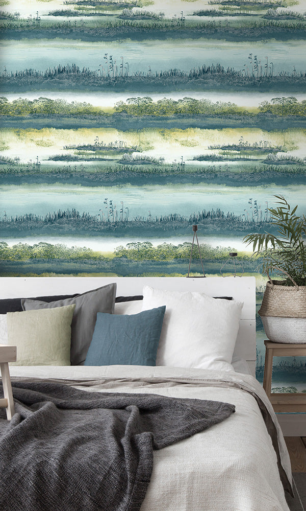
Teal Watercolor Wetlands R6105
Light Side vs. Dark Side?
Whether you're a big fan of using light colors to accentuate the feeling of space or dark colors to create a more intimate room, both light and dark wallpaper colors have their own unique set of benefits. When selecting the perfect wallpaper color for your space, be sure to keep in mind how colors will interact with your room – what kind of lighting is present? What size is your space? What "mood" or aesthetic do you want to create? Keeping all of these questions in mind will help you along the way as you pick out the perfect wallpaper for your room! What kind of wallpaper colors do YOU prefer – light colors or dark colors? Let us know in the commends below!

Walls Republic Interior Design Blog - DESIGN ADVICE
DESIGN ADVICE is where you can learn more about wallpaper - how to use certain colours, wallpaper designs perfect for smaller spaces, what do wallpaper symbols mean, and so much more. Our goal is to help you understand everything there is to know about wallpaper products. If you have a particular wallpaper topic or product you want us to write about, let us know in the comments below.
As always, be sure to follow us on Facebook, Twitter, and Instagram to stay up to date on all of Walls Republic's latest products, promotions, giveaways, and much more!

